

long long ago, on a cold december’s morning in the year 2006, i plunked myself in the very chair where i now sit, promptly pulled it up against this old pine writing desk, and began to tap away in what amounted to writerly slippers, confining myself to the cozy innards of the keyboard, the span where the alphabet in simple form is sprawled, swatting away any urge to reach for capital letters, a form that felt too, too constrained for the musings of the pre-dawn hour in which i chose to write dawn after dawn after dawn.
typographically speaking, i steered clear of the shift key. i typed away without bothering to extend my pinky beyond the alphabet rank and file. stuck firmly to the three rows across, ten columns down that housed qwert and yuiop[]\ and their underlings. gave nary a thought to letters up or down. it felt comfier. looser. a distinct change from my day job where newspaper decorum demanded Up and down, up for proper names and the launch of every sentence, with that little trail of lowers queued right behind.
for some 1,286 posts it’s been that way. or this way, rather, here at the chair.
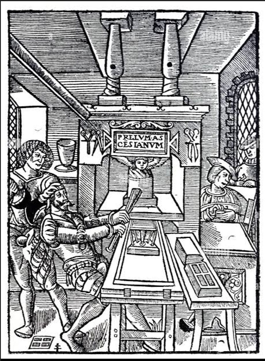
but now, somehow, the migration from the chair’s long years at old familiar wordpress to here, where big kids romp at Substack, seems to have stirred a long-sleeping conventional urge to type like a real-true writerly grownup, to reach for those distant keys, the ones that demarcate the Proper from the common, the true I from the shyer, happy-to-retreat-into-the-background, half-staff i, and to crown whatever word launches any sentence with the grander version of its form, aka its upper case (a term derived from the early typesetter’s two distinct drawers, one where the more frequently used letters were kept in the nearer, or lower case, and the other, where the less frequently used Capitals were kept up top in the upper case).
it’s not as if i didn’t know the rules; it’s simply that i found typing this way akin to shuffling familiarly in my fuzzy slippers. it became something of a romp, a writerly way of throwing caution to the wind, an expression of the sheer joy i’ve always found—and increasingly so—cobbling words into thoughts, into wonderings and meanderings. to type without traffic lights made for cruising down the writer’s highway, top down in my ’57 Chevy, curly locks blowing in the wind.
until it didn’t.
until it somehow started to feel, um, a bit off. an unnecessary—and perhaps off-putting—subplot that might be mistaken for an affectation, of which i have never ever been a fan. i felt the urge, suddenly, to hit the Shift and Run….(I promise to steer clear of “caps lock.” Another ranting all-caps screed or Screeder in Chief we do not need in this Republic of Fair-Use Letters.)
the rules—to substantiate my case—i know are these:
1.) Capitalize proper names.
2.) Capitalize the first word in a sentence and in all headings, or sub-headings.
3.) Minimize the use of capitals in common nouns and adjectives, except when denoting a particular national, religious, or linguistic grouping.
4.) Capitalize, always, the first-person pronoun, the stand-alone I.
5.) Do not, do not, be a capital offender and blather on in all-up diatribes, as has recently been documented in so much that flows from the house that is white (and aiming to be oversized) in our nation’s capital.
and now, having put the query out there, inquiring among the many chairs as to which mechanic might be preferred, it seems the Upper class has spoken. the vote, in fact, was not too far apart, but i admit to being swayed early on by the fine-minded participant who gently mentioned that she found all lowers a bit distracting, a typographic clutter needlessly getting in her way.
clarity being the beginning and the end of every writer’s quest, i shall now surrender my recalcitrant alphabetic ways, and begin to exercise that reach for the far left- or right-hand keys, the ones marked “shift,” the ones that all the big kids have used all along (even I learned their ways as far back as second grade, when scrawl I did in ups and downs).
Because I don’t make such shifts without considerable consideration, I went so far as to consult those chieftains of style, Misters Strunk, White, and their modern American usage counterpart, Brian A. Garner. Surprisingly, not a one of them had a word to mutter on the subject. And I’ve a hunch the reason why is humiliatingly so: It would never dawn on those proprietors of properness to leave a case unattended to. (Nor would they end that sentence as I just did, with that dangling preposition at its close.) A sentence sans height variation must be to them anathema of the highest order. Not worthy of merest mention.
Ah, but I did not cease my inquiry there. I turned too to the history and geography tomes and found that capitals are all over the map. Literally.
In Germany, those Teutonic peoples proud of standing tall reach for capitals every time they stake a noun in any sentence. And I mean any noun, a most common noun, nothing proper about it, except that in those long and winding Germanic sentences flying your capital flag makes it easier to track the nouns amid the crowded field of run-on words.
In Türkiye (the preferred spelling for the republic since 2022, when formally approved by the United Nations, no less), there is yet another twist, and it comes in the form of dots above the I when its flag is raised. Some little i’s are up with dots, some are not. Back in 1928, when the language commission of a fellow named Mustafa Kemal Atatürk ordered up a new alphabet (who knew you could do that?) they needed a round-about for the fact that the letter i came in two sounds in Turkish. To differentiate, so that say Istanbul did not arise reading wrong, they plopped a dot above the lean, mean stake and dubbed it İstanbul. Seems the wee ink blot, hard to read in the backrooms of hard drives, was the culprit of the great Java Crash of 2016, when all across Türkiye computers crashed, because that wafting dot threw software programs off their tracks; they knew not what to make of the capital flourish. Known as the “Turkish I Bug,” it took five years to be figured out and fixed. To this day, it’s confounding programmers worldwide and is considered an infamous internationalization trap that rarely fails to break the code. (As if to prove my point, the very instant I italicized that quirky dotted-capital-I in Istanbul, my computer balked and Substack sent up smoke signals!)
Turns out, a quarter of the world needn’t reach for that shift key at all. If only I typed in Chinese Hanzi, Devangari or Bengali, Arabic, Hebrew, Japanese, Korean, or Thai, I’d fit right in with my typographic sloth. That comes to roughly 26 percent of the world for whom capitals need never cross their mind. Or their keyboards. The big kahunas of the ‘board in the rest of the world, the big-C Capitals gang, are abundant in Latin, Cyrillic, Greek, and Armenian scripts, comprising roughly 74 percent of the world’s languages. (Our English language employs the Latin alphabet, adding an extra toss to this world salad.)
As innovations of language go, the capital letter is the OG, ubiquitous in ancient Greek and Roman inscription, where chiseling into marble or limestone or travertine made for a one-size-fits-all, blocky alphabet. It’s the little guy, the lower case, that’s the late-comer to the game. Once scribes began to write on papyrus, vellum, and parchment, scribbling manuscripts all day long, they saved time by writing smaller, faster, rounder. It was thought by some (the haughty, high-minded, no doubt) to be rather a sloppy add-on, this time-saving shorthand favored by those tasked to the scriptorium. (If you were bent over inky pages of a tome for umpteen hours in a day, for years and years on end, dotting i’s and crossing t’s into eternity, you too might argue for any means of getting ever more swiftly to a sentence’s last dab.)
It wasn’t till the eighth and ninth centuries in France that the first use of “bicameral” letters—that is upper and lower cases—were put to the page. All credit there goes to Alcuin of York, an Anglo-Latin scholar and monk invited by the emperor Charlemagne to run his Palace School. It was Alcuin who inked the alphabet in a style that came to be known as “Carolingian miniscule,” a script that deftly combined capital letters at the start of every sentence with lowercase to follow. That script stuck for some 400 more years, when it gave way in the twelfth century to Gothic overkill.
But Renaissance humanists in the fourteenth century had no taste for the heavy-handed Gothic font, and restored the monk’s scrubbed-down Carolingian script, mistakenly thinking the pages found in medieval monastic libraries had been written in the official font of ancient Rome, and promptly named it litterae antiquae, or “ancient letters.” The humanists, Petrarch chief among them (complaining the black blobs of Gothic lettering caused “eye strain” and came across as “pompous”), mocked the overwrought angulations of Gothic letters they deemed messy and barbaric.
Enter into this typographic morass Johannes Gutenberg, the mastermind of the so-called modern, mass-production printing presses, who combined his fluency in the properties of hard and soft metals with a megadose of ingenuity and revolutionized printmaking. It was in the late 1440s that he devised moveable type, metal blocks of letterforms kept in two separate drawers or cases, the upper and the lower. Being of German origin, though—based in Mainz, near Frankfurt—he was firmly in the Gothic camp, and even a quick glance at any Gutenberg page suggests he didn’t see it as barbaric at all. He dove right in, launching his press with a full complement of heavy Gothic. He wanted his original Bible of 1455 to appear hand-written, pomposity be damned, for this, he argued, was the Word of God. (And, besides, heavy Gothic script was, at the time, the standard for sacred texts in Germany; to have used a lighter Italian script for the German Bible would have been seen, mon Dieu, as a radical aberration. Damnable indeed.)
So there you have it, though hardly a revolution to find this wee corner of the blogosphere now evolved to new clarity. No longer will you have to wonder if my “i” is a runaway from the untamed herd of vowels, or if I intended it to refer to little old me. No longer will you have to wonder where one sentence ends and another begins, should you overlook the pin dot that is the punctuational sign post signaling one thought’s close before the next one rises.
And I, I shall struggle to remember to reach. Always, dear Chairs, always will I bend for you. Whatever makes your day go down just a wee bit smoother.
While the rest of the world concerns itself with sea tolls and nuclear proliferation, while ICE is back at it, needlessly and senselessly erasing lives, we shall muddle unobtrusively along aiming simply to make the reading of a single sentence a pinch less grueling.
***
Despite all the many structural changes here at the Chair of late, the Chair will always be the Chair, where hearts come first. And so it is with the heaviest of hearts that I add this note of all-embracing love to one of the Original Wise Women of the Chair, our beloved lamcal whose heart is grieving, and ours right along with her. Her grief is not mine to tell, but please please send love her way. She is simply the very finest among women, and among mothers, most emphatically.
***
I feel compelled to add a second short note, as the dawn rolls in murkily here where I sit, the haze of wild fires smokily suspended in air, and the pall that’s cast feels more than climatological. The birds this morning are nowhere in sight; their wee, wee lungs I fear are filled with silt. And the stillness, the stillness is haunting. I can’t pretend this all rolls past me. I listened in last night to the madness spewing from the presidential podium. To some of it anyway. All day, my own abbreviated lungs had worked so, so hard to suck the oxygen from air, and my heart pounded, a kettle drum inside my ribcage, pounding, pounding. What have we wrought is what I ask, over and over. I am on my knees, to beg forgiveness for our sins. The sins of avarice and cruelty that fill the daily news. To gasp for breath seems to be the posture of the day, and I wonder will we make it till this dark fog lifts, till some national cleanse rolls through, now months away still. Always, always, I turn to the great good souls who gather here, who pull up chairs, and ply on anyway. Loving. Tending. Bringing in the grains of light through all the cracks and shatterings. Breaking up the fog.
Beloved Chairs, where did you find a speck of hope this week?
First and foremost, I send love and light to lamcal during this grieving time. 💔
As to your capital letter situation, I was so used to your writing without them that it might take me a while to get used to the standard form here.
I loved the tidbit of historical context on how uppercase letters and lowercase letters got their names.
And last but not least, I found hope this week in a wedding announcement received from two beautiful souls who are just a wee bit younger than me. ♥️
Love, hh
Whether or not you use the Big letters or small , we welcome your words. Love.